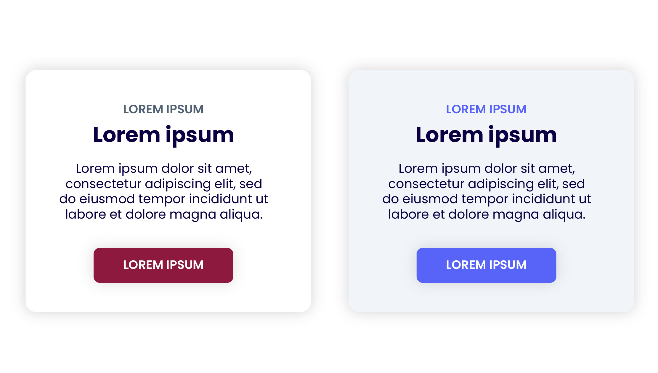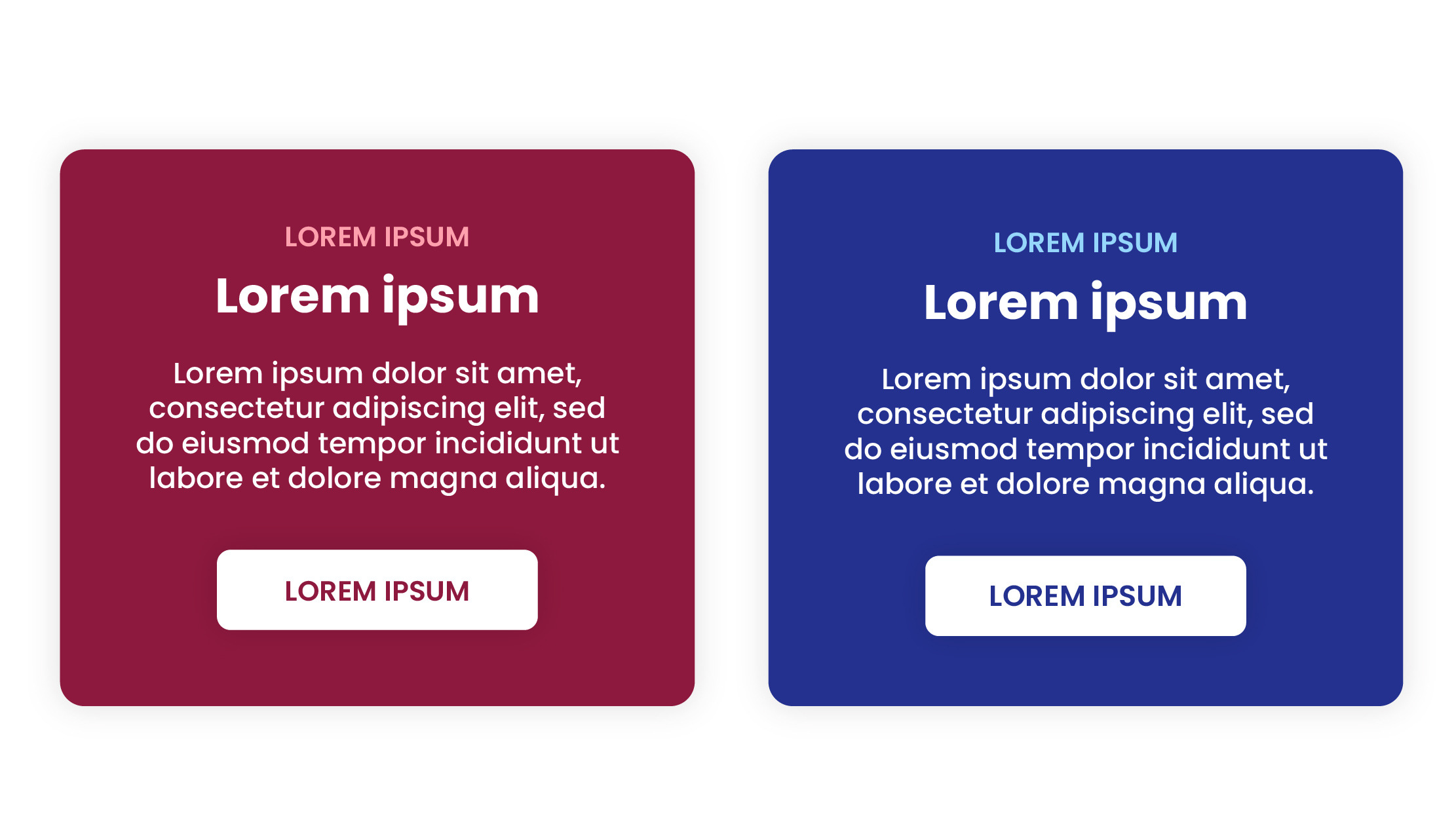
Wine Red
Hex: #8D193E
RGB: 141, 25, 62
CMYK: 0, 82, 56, 45
PMS: 208c

Charcoal
Hex: #25282A
RGB: 37 40 42
CMYK: 77 64 58 72
PMS: 440c
Wine Red
Hex: #8D193E
RGB: 141, 25, 62
CMYK: 0, 82, 56, 45
PMS: 208c

Egyptian Blue
Hex: #24318F
RGB: 36, 49, 143
CMYK: 75, 66, 0, 44
PMS: 2746 C

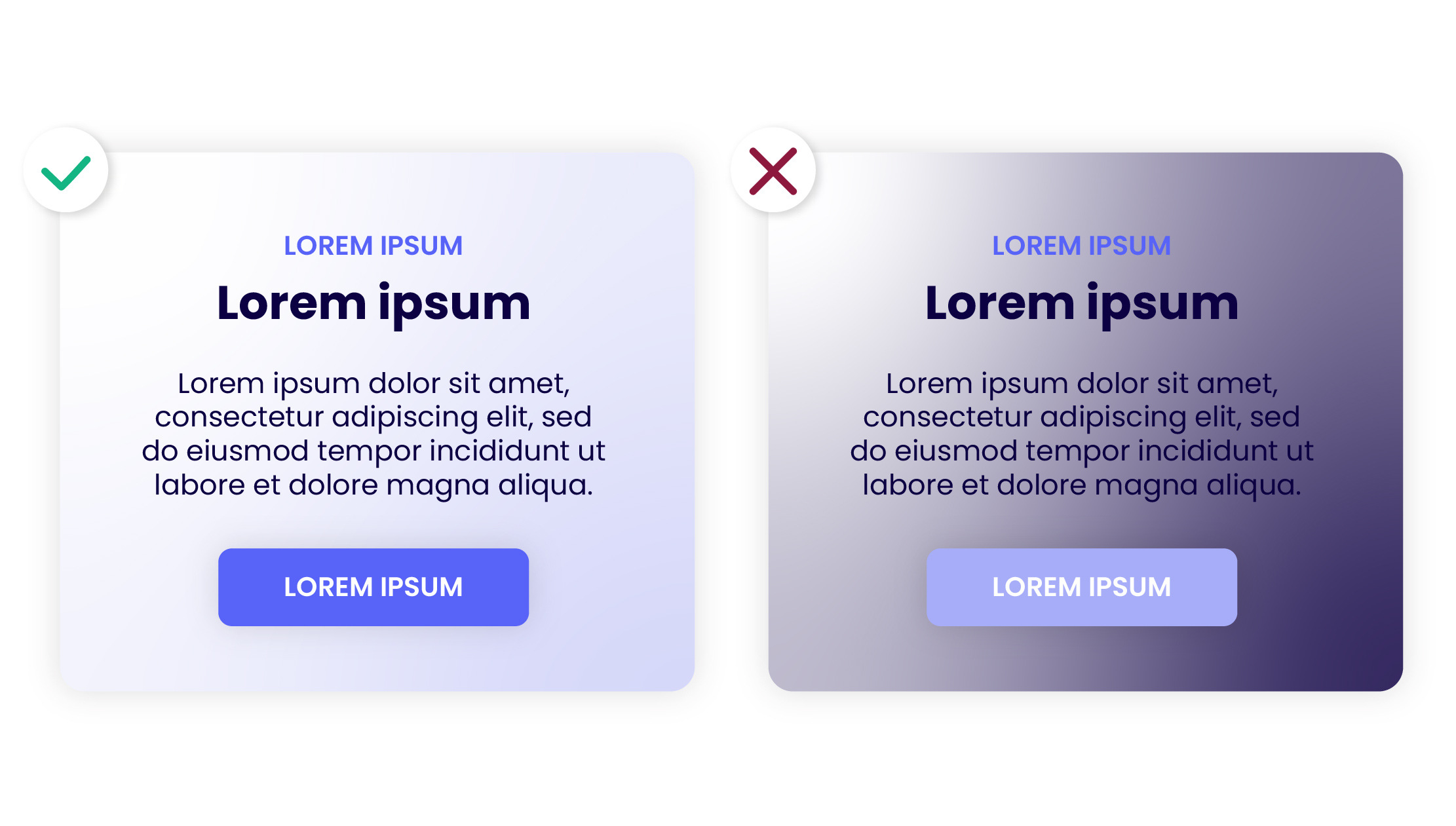
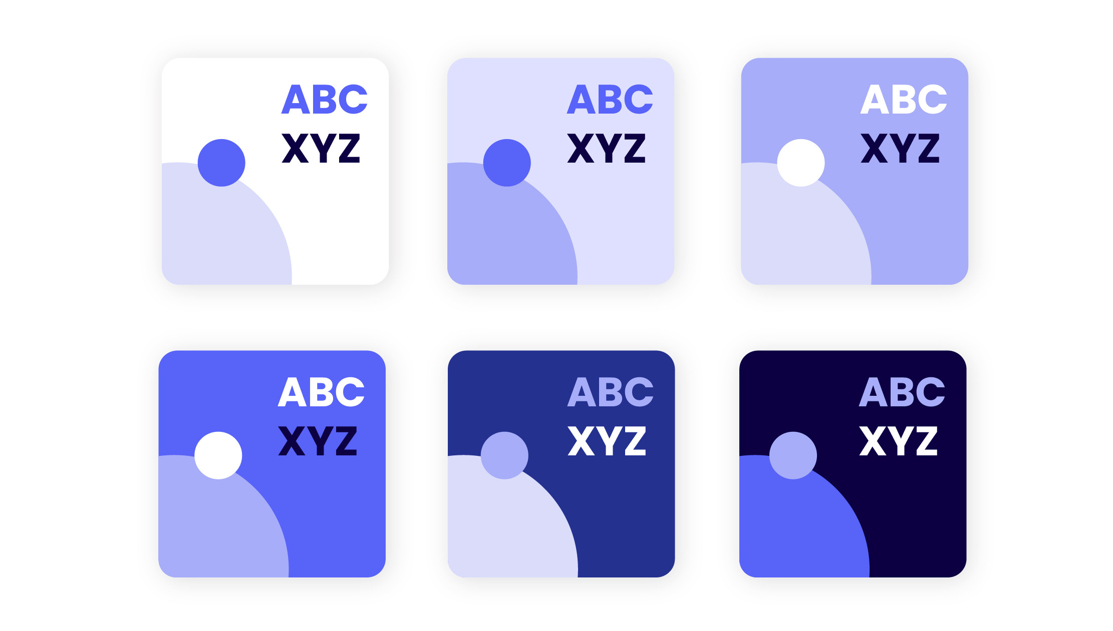
Neon Blue
Hex: #5863F8
RGB: 88, 99, 248
CMYK: 65, 60, 0, 3

Perano
Hex: #A7ADF8
RGB: 167, 173, 248
CMYK: 33, 30, 0, 3
PMS: 2716 C

Quartz
Hex: #DADCFA
RGB: 218, 220, 250
CMYK: 13, 12, 0, 2
Pure White
RGB: 255, 255, 255
CMYK: 0, 0, 0, 0
PMS: Pure brilliant white

Alice Blue
Hex: #F1F5F9
RGB: 241, 245, 249
CMYK: 3, 2, 0, 2

Pajama Stripes
Hex: #F8FAFC
RGB: 248, 250, 252
CMYK: 2, 1, 0, 1

Ghost White
Hex: #E0E5EC
RGB: 224, 229, 236
CMYK: 5, 3, 0, 7

Night Blue
Hex: #0C0042
RGB: 12, 0, 66
CMYK: 82, 100, 0, 74

Black Coral
Hex: #516073
RGB: 81, 96, 115
CMYK: 30, 17, 0, 55

Light Slate Grey
Hex: #74859C
RGB: 116, 133, 156
CMYK: 26, 15, 0, 39
Pure White
Hex: #FFFFFF
RGB: 255, 255, 255
CMYK: 0, 0, 0, 0
PMS: Pure brilliant white

Pumpkin
Hex: #FA851A
RGB: 250, 134, 26
CMYK: 0, 46, 90, 2

Deep Orange
Hex: #FE9D47
RGB: 254, 157, 71
CMYK: 0, 38, 72, 0

Romantic
Hex: #FFC698
RGB: 255, 198, 152
CMYK: 0, 22, 40, 0

Serenade
Hex: #FFE5D4
RGB: 255, 229, 212
CMYK: 0, 10, 17, 0

Dodger Blue
Hex: #1593F4
RGB: 21, 147, 244
CMYK: 91, 40, 0, 4

Fresh Blue
Hex: #0AB9FF
RGB: 10, 185, 255
CMYK: 96, 27, 0, 0

Columbia Blue
Hex: #95D6FB
RGB: 149, 214, 251
CMYK: 41, 15, 0, 2

Light Cyan
Hex: #CCEDFF
RGB: 204, 237, 255
CMYK: 20, 7, 0, 0

Mountain Meadow
Hex: #14B582
RGB: 20, 181, 130
CMYK: 89, 0, 28, 29

Shamrock
Hex: #49CAA1
RGB: 73, 202, 161
CMYK: 64, 0, 20, 21

Riptide
Hex: #88EAC9
RGB: 136, 234, 201
CMYK: 42, 0, 14, 8

Mint Chiffon
Hex: #D7FBE7
RGB: 215, 251, 231
CMYK: 14, 0, 8, 2

Cardinal
Hex: #C12338
RGB: 193, 35, 56
CMYK: 0, 82, 71, 24

Rose Red
Hex: #F04159
RGB: 240, 65, 89
CMYK: 0, 73, 63, 6

Illusion
Hex: #FFA0AD
RGB: 255, 160, 173
CMYK: 0, 37, 32, 0

Carousel Pink
Hex: #FFDCE1
RGB: 255, 220, 225
CMYK: 0, 14, 12, 0