Brand guide / Design System

icon-logoTechstep logo

 The cornerstone to our identity is our logo. It is synonymous with who we are and is the most immediate representation of our brand, whether out in the big, wide world or living in the digital realm. 

Logo

Immediately you can see that the new ‘S’ has echoes of the human form in motion. Techstep is all about people, and specifically about setting people free to work smarter. The mark also clearly conveys the idea of continuous forward movement. This unbroken circle is there to represent the idea of both constant improvement and crucially, sustainability – a key element of the brand’s DNA.

ourlogo-techstep
The new logomark intimates that Techstep empowers people to move forward into a more effective, more connected way. We are reminded that in business, we form crucial relationships and connections with our customers, colleagues and partners. By working together, we are changing the world of work through smarter mobile technology.

The theme of continuity is further represented by the fact that subconsciously, the form strongly resembles an infinity symbol.

The mark

The new Techstep ‘S’ has been created to reflect different aspects of the brand in a single form. It will appear as part of the brand name and also as a stand-alone device, adding flexibility to our new visual identity. Beyond these two uses, aspects of the mark can be used as graphic motifs across different media to give all Techstep communication a distinctive and unified feel.

The S is constructed from 3 separate shapes. The ring, which sits above and the two interconnecting pieces that make up the S.
ourlogo-mark-shapes
ourlogo-mark-symbol

Variants

Always ensure sufficient contrast when choosing logo placements.
ourlogo-variants-01
ourlogo-variants-02
For white and lighter backgrounds, use the master logo.
ourlogo-variants-03
ourlogo-variants-04
For darker backgrounds, use the white version.

Usage

Always ensure sufficient space around the logo. You can use the x height as a guide for the exclusion zone. Our logo is designed to be used at scale for both screen and print, see the minimum size recommendations below.
ourlogo-usage-techstep
ourlogo-usage-minsize-print
Minimum size for print: 25mm/0.98 inches width
ourlogo-usage-minsize-screen
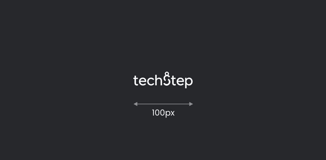
Minimum size for screen: 100px width

Guidance

A few handy tips to help you on your way…
ourlogo-guidance-01
Always make sure the contrast is sufficient when using background colours and imagery.
ourlogo-guidance-02
Always leave enough space around the logo so it can breathe, and never distort it.

SmartControl

SmartControl-logo
SmartControl-logo-reverse

SmartControl-icon-1

SmartDevice

SmartDevice-logo

SmartDevice-logo-reverse

SmartDevice-icon-1

SmartWorks

SmartWorks-logo
SmartWorks-logo-reverse
SmartWorks-icon-1