Brand guide / Design System

icon-typographyTypography

Typography is a key part of our brand, being one of the core blocks upon which we build our identity, both in terms of the typeface itself and also how we use it. 

Typeface

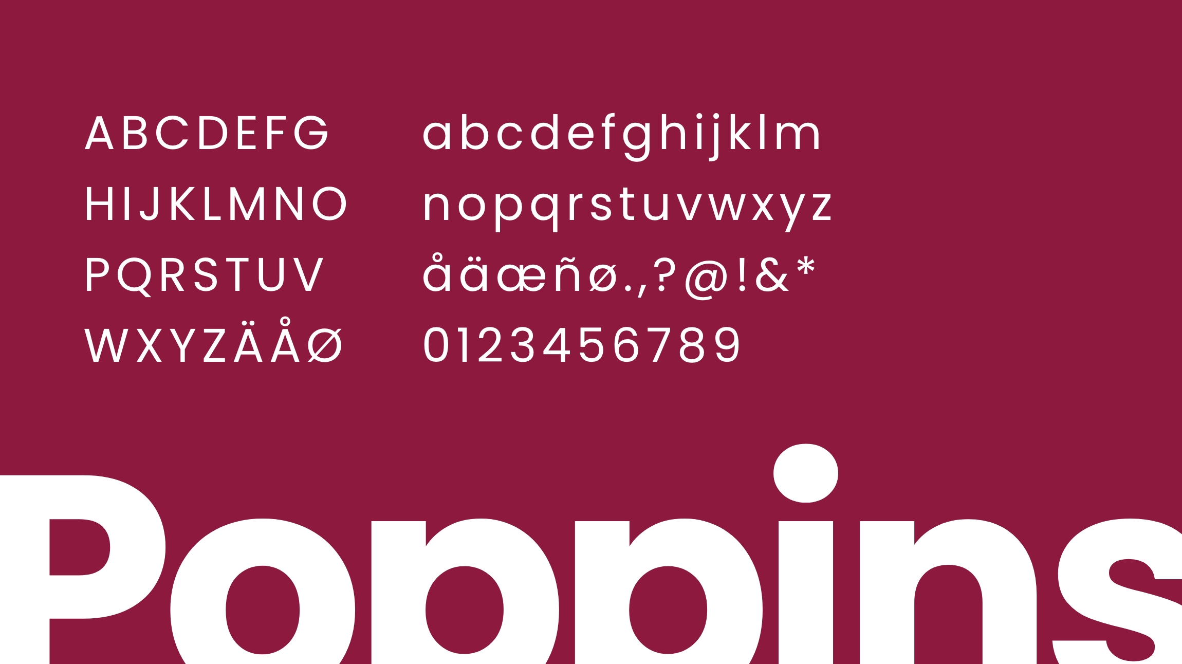
Poppins is a new corner to a long tradition of Geometric sans serif typefaces. A modern classic if you like. Each letterform is nearly monolinear, with optical corrections applied to stroke joints where necessary to maintain an even typographic balance. Many of the Latin glyphs (such as the ampersand) are more constructed and based on pure geometry, particularly circles.

And what’s more, Poppins is available on Google Fonts. 100% free and open source.

typography-typeface

Hierarchy & weights

Poppins is available in numerous weights ranging from Extra Light all the way through to Black. Try to maintain a hierarchy when dealing with typography to ensure clarity and consistency. For instance if you use Bold for the main heading, pair that with Semi Bold for a sub heading. Body copy should always be set in Regular.

typography-hierarchy
typography-weights

Fallbacks

Poppins should always be used where possible. If you can’t access Google Fonts, then please use Helvetica or Arial as fallback.

typography-fallback-01
typography-fallback-02

Guidance

A few handy tips to help you on your way…

typography-guidance-01
Choose a suitable line height and length for your paragraphs.
typography-guidance-02
For greater contrast, use light text on dark images and vice versa.